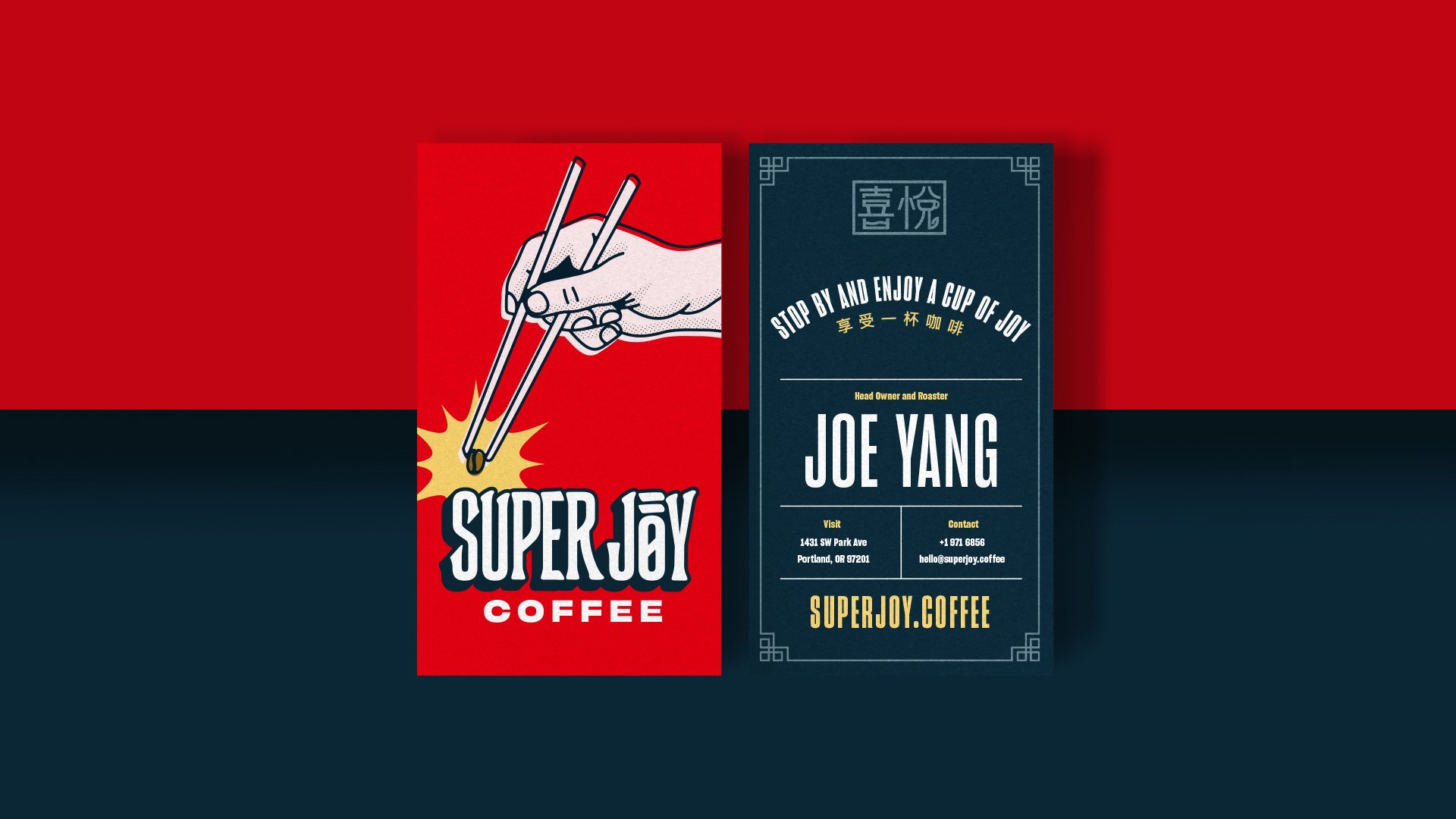
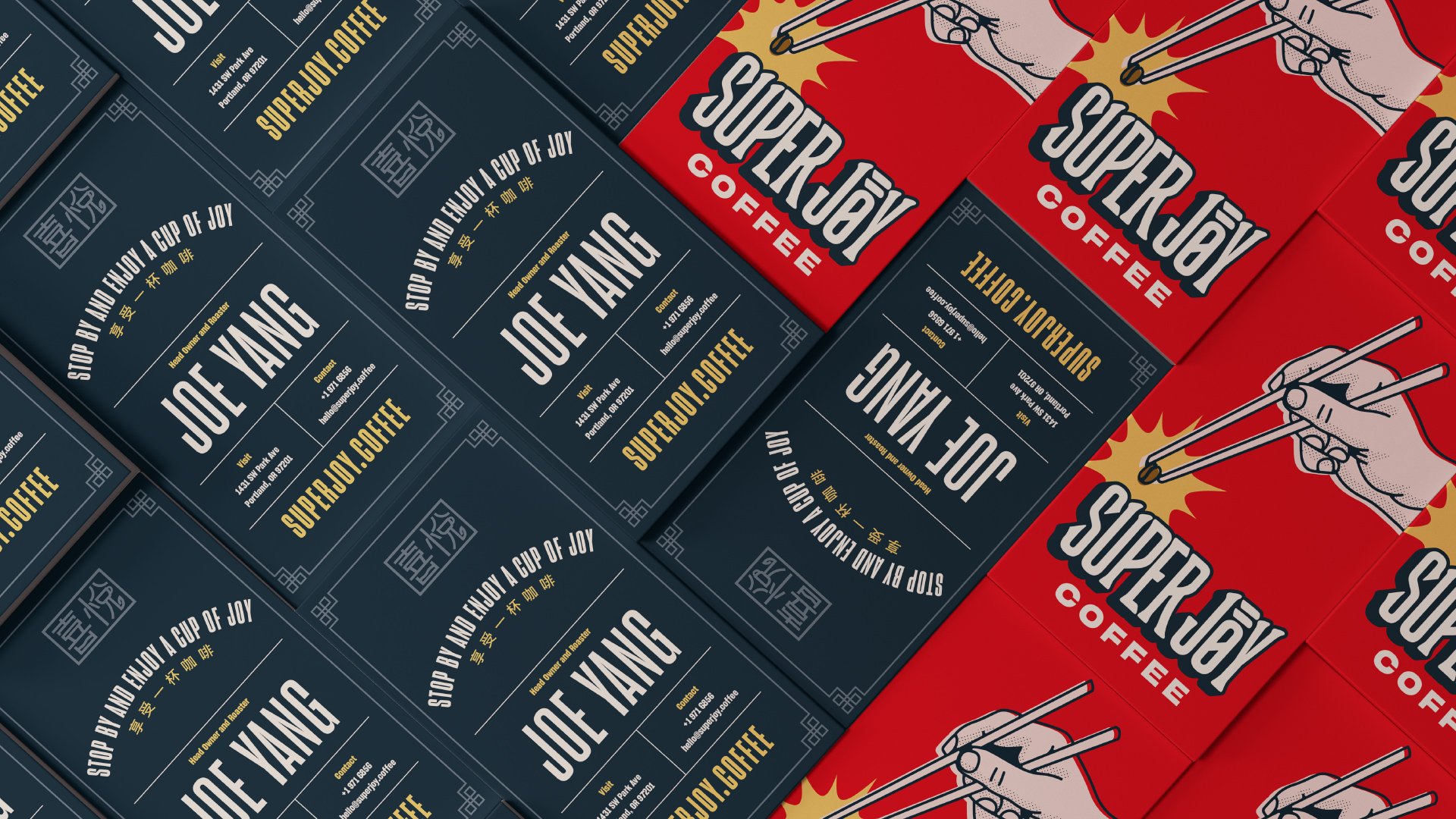
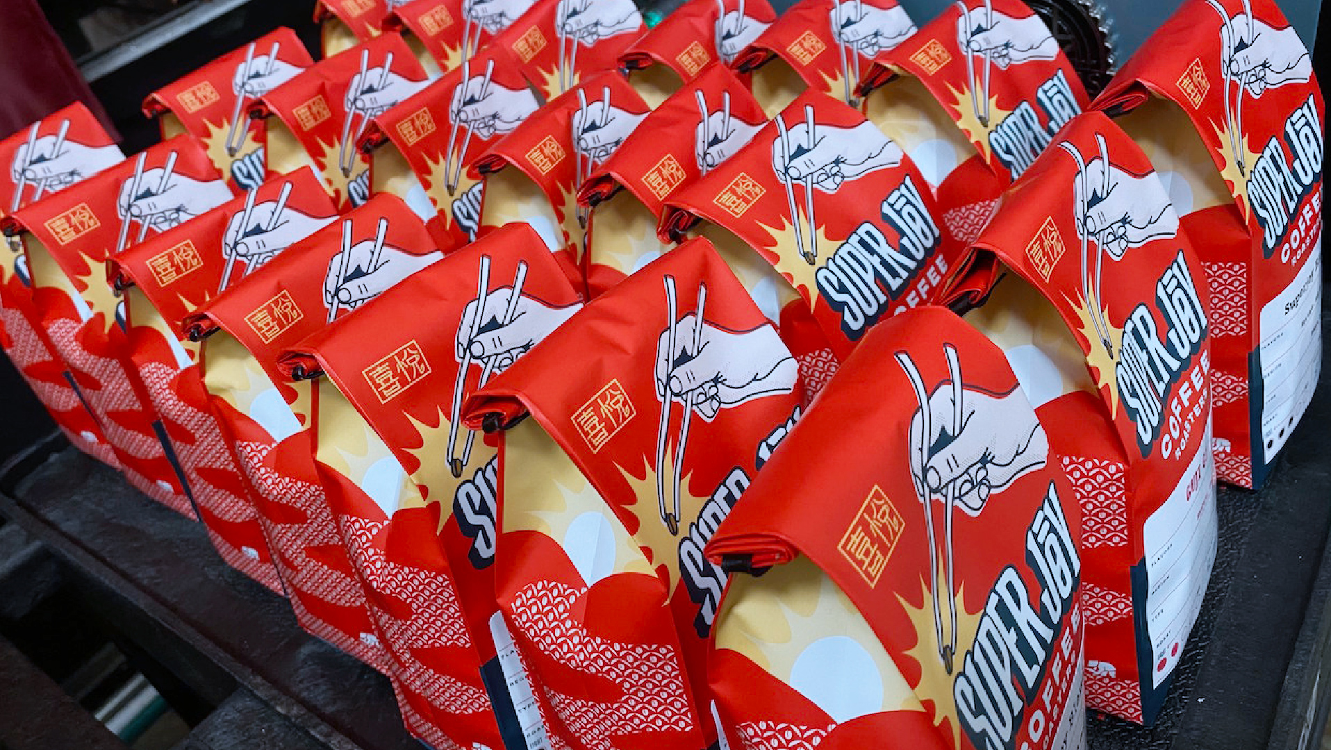
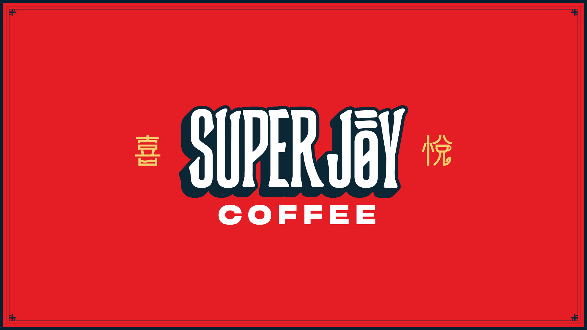
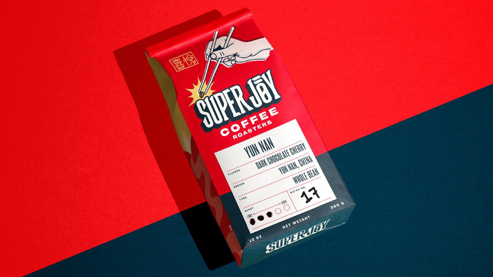
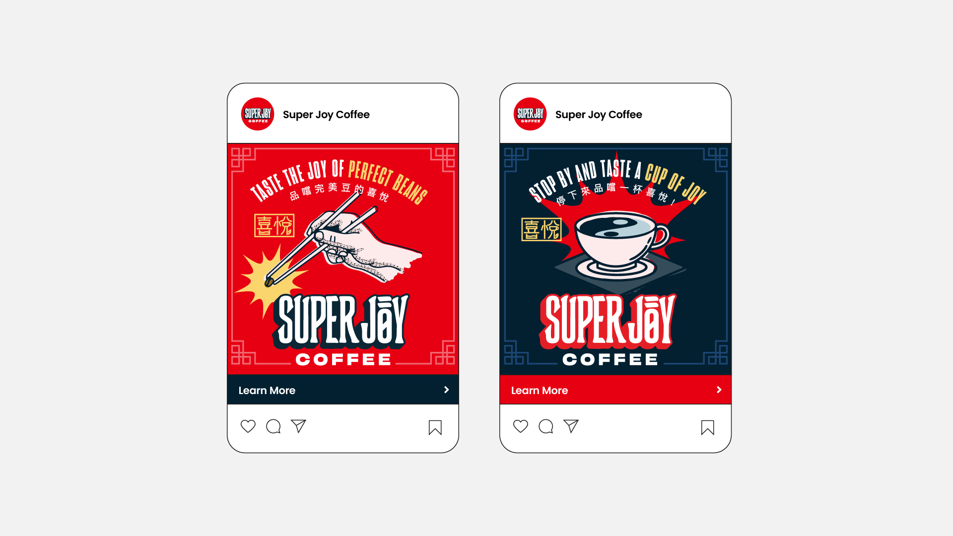
SuperJoy

Spreading the joy of Chinese coffee in Portland.

Launch
The Super Joy Coffee logo is navy blue and white text sitting on a red background. It features two Chinese characters on either side in yellow.

Background

Portland is an American coffee hub. There are at least 30 coffee roasters and more than 150 coffee shops in Portland. So naturally, when it came time to open his own shop, SuperJoy owner, Joe Yang, came to the City of Roses to make his mark. The only problem: how in the world does a coffee shop stand out in Portland? Joe, being a master barista, followed his instincts and came to Headword to give his brand some buzz.

Services Provided

  • Brand Identity
  • Packaging
  • Retail
A Super Joy coffee bag sits against a red and navy blue background. The bag features an illustrated hand holding chopsticks with a coffee bean at the end. The label reflects the coffee beans came from China.

Old Logo

The previous Super Joy logo still features the signature red but the word “Joy” is vertical in an octagonal shape. The text below is boxy with varying weight to each line.

New Logo

The new Super Joy logo has text that is easier to read and more rounded. The navy shadow of the letters makes the words pop against the red.
Someone with a gray jean jacket and painted nails holds a Super Joy to-go cup. It’s red with the Super Joy Coffee logo and a white circular design on the bottom half of the cup.

Approach

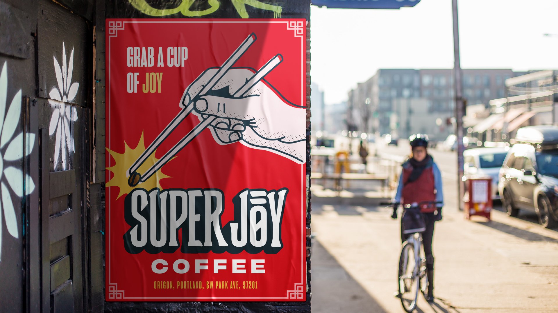
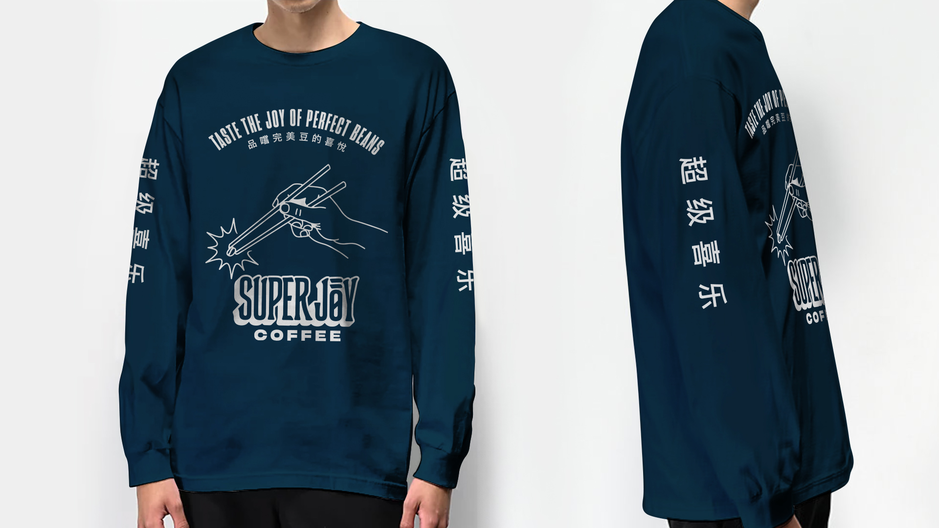
One thing that helped Joe stand out was his proud Chinese heritage. Joe was uniquely positioned to be the only coffee shop in town serving beans sourced from China, as well as other unique locations not normally known for their coffee beans. We decided to harness this special place in the market and show Portland that this wasn’t just a coffee shop, but a whole new experience for coffee lovers.
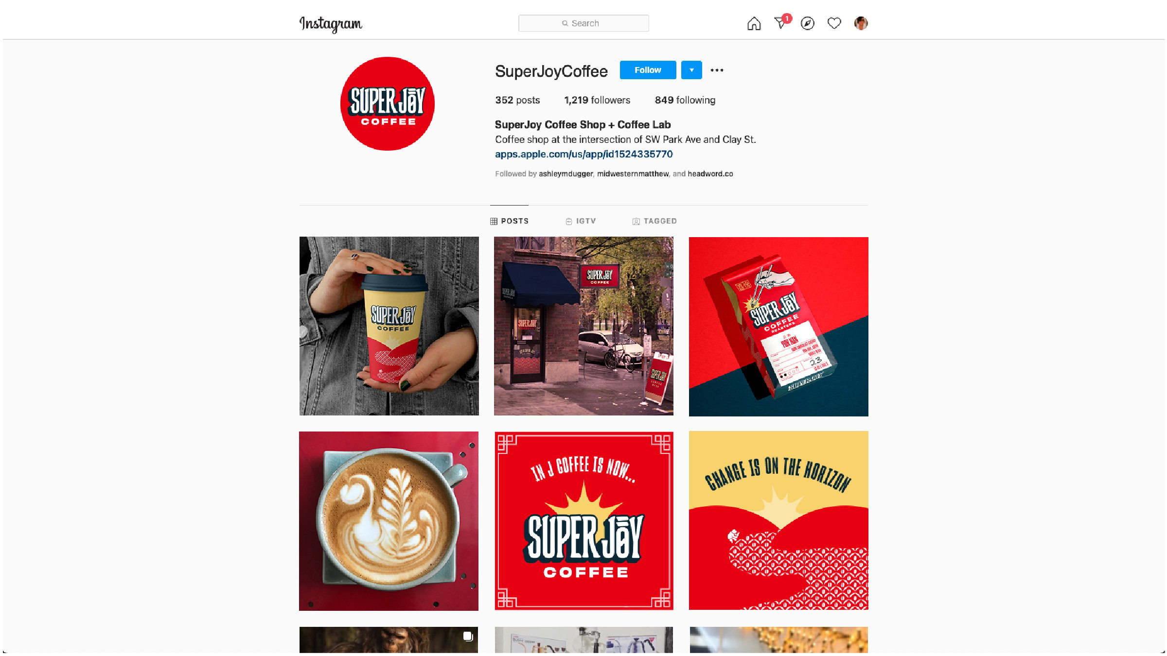
The Super Joy storefront shows how brand identity comes to life. The new logo is on two sides of the building with a red wave rising from a coffee mug on the corner. There’s also an A-frame sign on the sidewalk that says “Stop by for a cup of joy!”
The business cards are red on one side and navy blue on the other. The red side features the logo with a hand holding chopsticks and a coffee bean. The navy side feature the contact information of the cardholder and the shop’s website.
The business cards are laying side by side.
Super Joy coffee bags sit side by side in the shop waiting to be purchased.
In the foreground, there’s a Super Joy Coffee poster. It’s got a similar design to the bag of coffee with a hand, chopsticks, and coffee bean. In the background is a bicyclist riding down a city street.

Creative

We infused Joe’s Chinese heritage and love of coffee throughout all of Super Joy’s branding. From coffee bags, to cups and t-shirts, we presented Portland with undeniable cultural authenticity in a city where representation is appreciated. We created a custom logotype using various symbols and Chinese characters to make this brand feel as genuine to Joe as it could be.

When designing the bags, we created a pattern to go along the sides inspired by Chinese coffee farmers. We crafted all of the messaging to give insight as to who Joe is, how much love and care go into each bag, and what makes Super Joy so special. Signage, social posts, and merch were also developed for this project, as a way to further the store’s reach throughout the city.

A Super Joy mobile cafe is a striking red truck with the logo on the passenger door. The side panel shows rolling hills with a yellow rising sun. There are illustrated beans among the hills.
A person wears a long-sleeved navy Super Joy shirt. The front reads “Taste the joy of perfect beans” with Chinese characters and a hand, chopsticks, and coffee bean. The sleeves also feature Chinese symbols.
A person wears a short-sleeve pink Super Joy shirt. The back has the Super Joy logo with a coffee cup below it. In the coffee cup is the yin and yang symbol.
A laptop with the Super Joy website sits on a desk between a phone and notebook and a coffee cup. The website is mostly red with the logo and the words “Brew A Cup Of Joy!”
Two ad mockups feature the icons of Super Joy. One is the hand holding chopsticks and a coffee bean while the other is the coffee cup with the yin and yang symbol.
A look at the Super Joy Instagram feed shows a series of branded images. They reflect how brand identity comes to life in social media.
A variation of the Super Joy logo replaces the “O” with a steaming cup of coffee. Inside the coffee is the yin and yang symbol.

Results

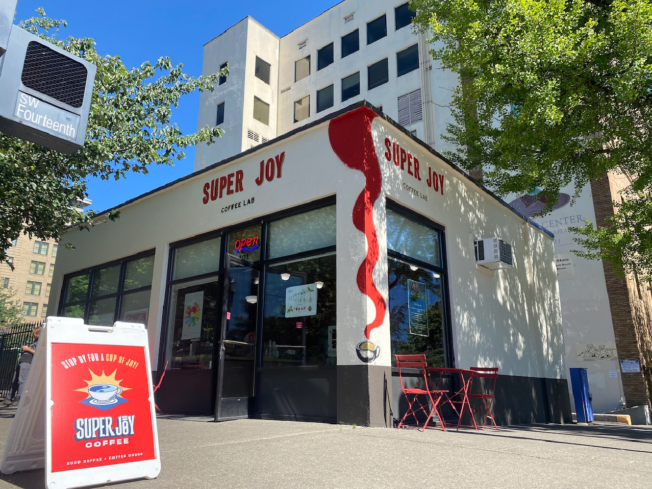
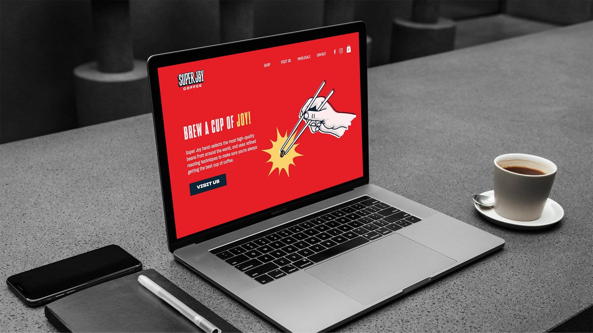
An extremely happy client who reported an increase in clientele in his shop and a second revenue stream that helped our client expand their business during the pandemic.

Two Super Joy posters sit against a white brick wall. The one on the left directs customers to the shop. The one on the right features the logo with the hand illustration.
DEFINE YOUR BRAND.

Ready to take that next step?
We’d love to hear from you.