EYE.Q.ITY

Helping kiosks disrupt the eyewear business

Grow
A glasses case sits next to a glasses box that says, “Welcome to your premium eyewear experience. Once you see it, you’ll never want to go back.” Below that are a pair of glasses and the other side of the box with the logo.

Background

The eyewear industry is kind of fuzzy when it comes to pricing. EYEQ.ITY started out of a need—how can we get high-quality, premium eyewear for a lower cost? Traditional eyewear retailers have such a high market share in the category, it’s difficult to break through. EYEQ.ITY saw how the large eyewear brands were operating and found a better way of doing things.

Services Provided

  • Brand Identity
  • Campaigns
  • Content Creation
  • Research & Strategy
  • Video & Animation
An ad on mall signage sits in between rows of stores. The ad shows hands holding up the same pair of glasses. The one on the left has a $600 price tag. The one on the right has a $149 price tag. The text below says, “See the difference? Neither do we.” The logo is below it.
Redesigned business cards have the logo and the text, “Get a great pair of glasses in under an hour for $150 or less” on the front. The back is the address and contact information for that location. The business cards sit on a marble surface.

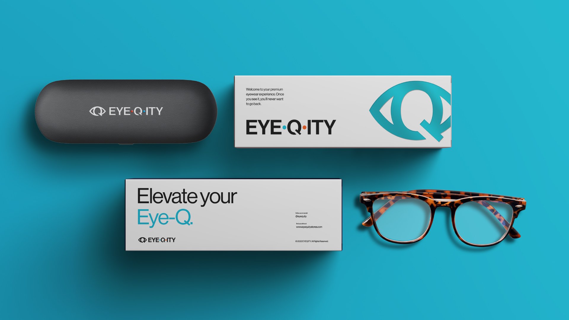
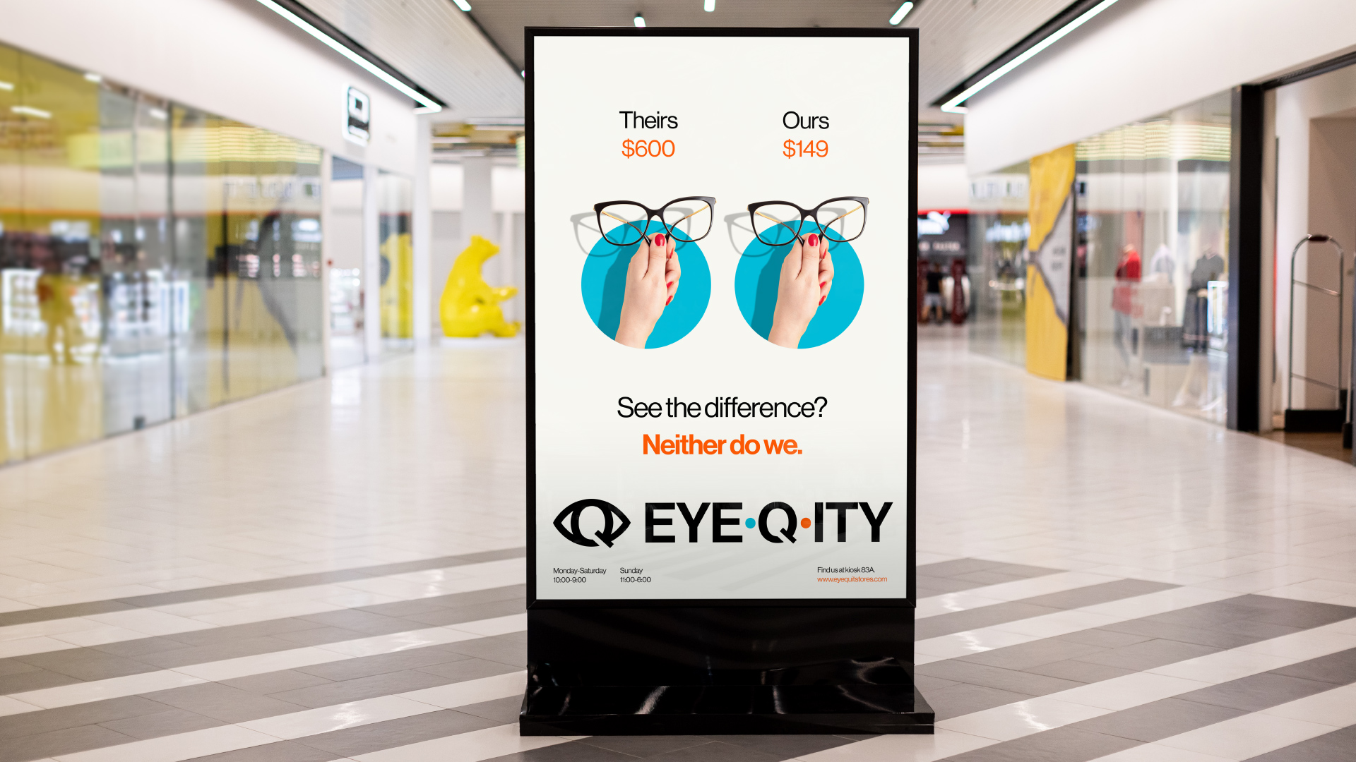
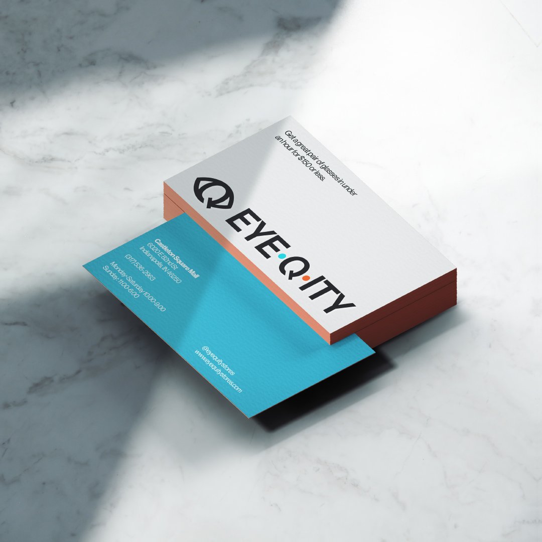
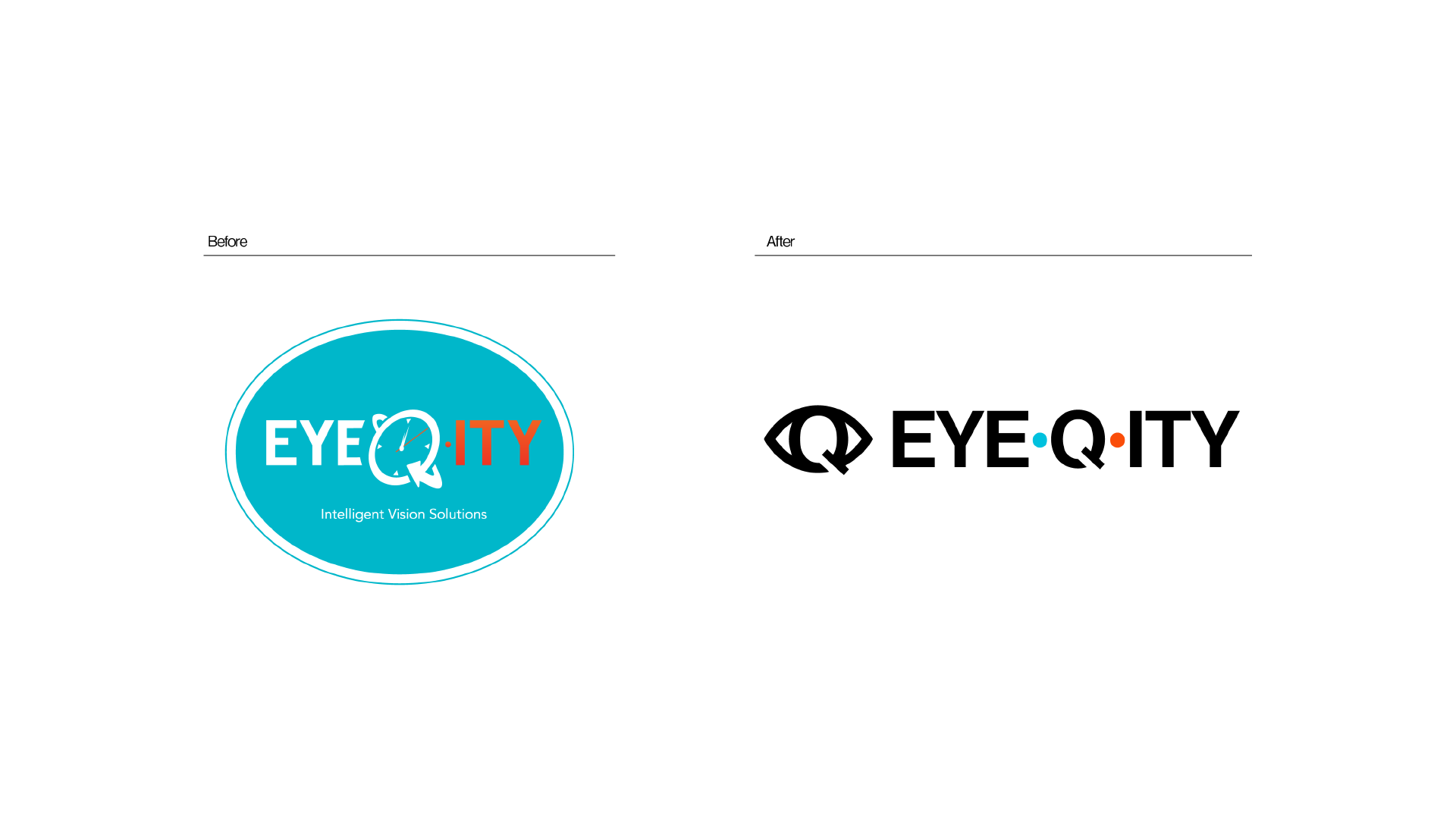
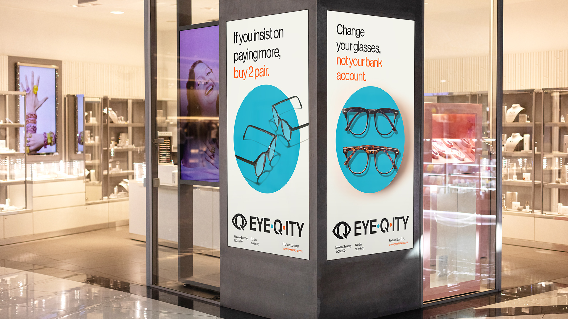
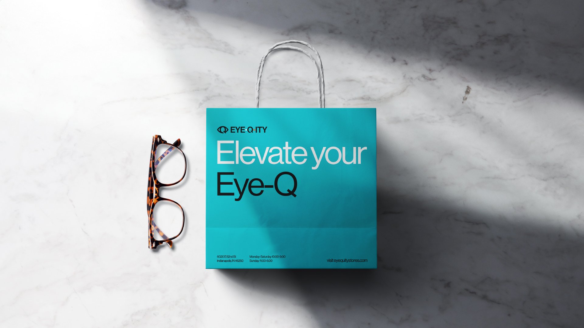
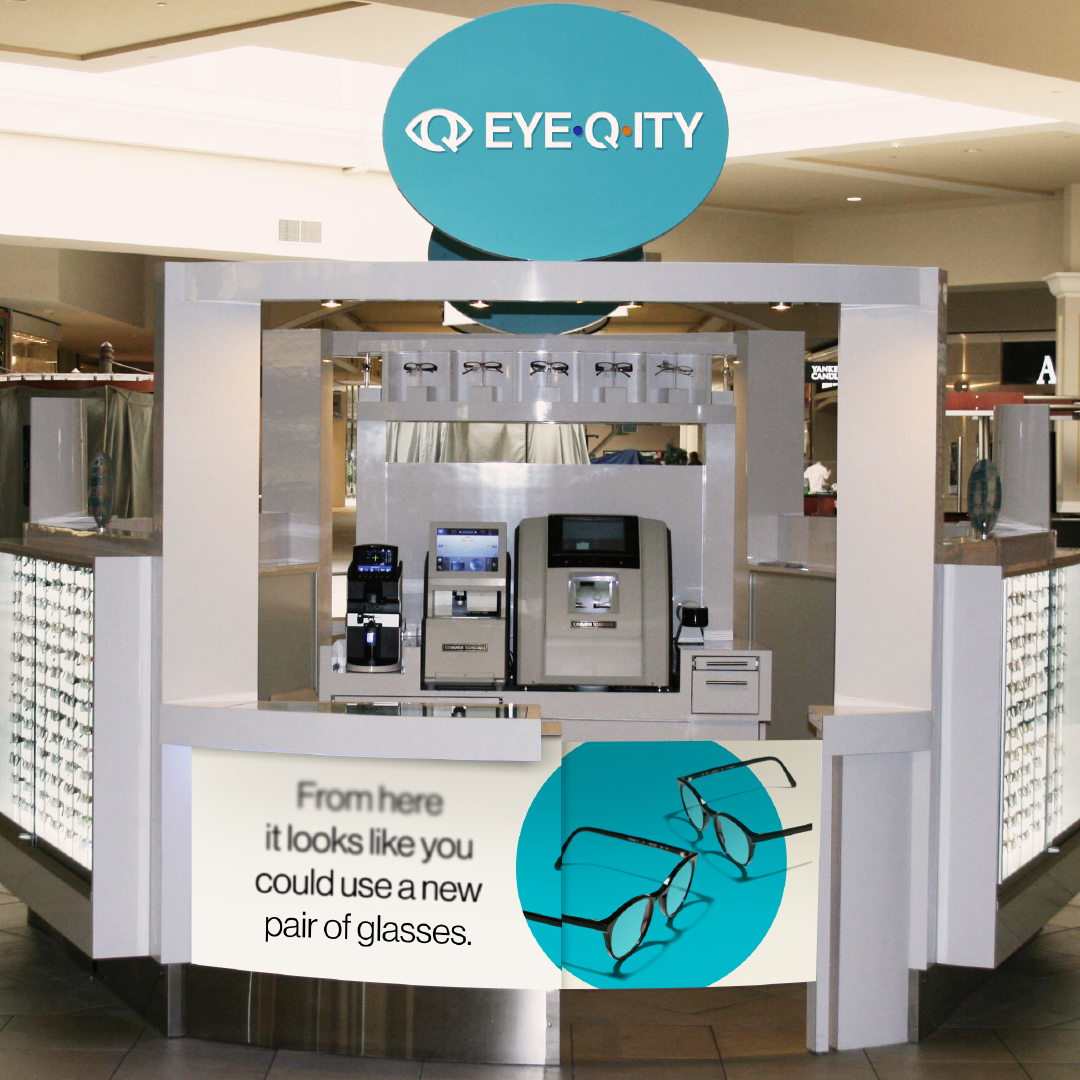
Time is money, as they say, and EYEQ.ITY took this to the heart of their business model. They were offering premium glasses for $99 that customers could take home in an hour or less. The customers only needed to bring a prescription and pick out a pair of frames. It was time to spread the word about this business model within the eyewear space. So they came to Headword for some creative clarity.

The old EYEQ.ITY logo is on the left. The “eye-q” is in white, the “ity” is in orange, and both are encircled in teal. The “Q” is shaped like a clock. The new logo is on the right. The text is all one color with a teal and orange dot on either side of the “Q.”

Approach

EYEQ.ITY had an image problem. Their look was a little outdated, and their logo was difficult to decipher. When it comes to something as significant as eyeglasses, consumers are looking for a place they can trust. We wanted to update their image to be more sophisticated, approachable, and trustworthy.

Two posters sit on either side of a storefront pillar. Both ads feature two pairs of glasses. One ad says, “If you insist on paying more, buy 2 pair.” The second ad says, “Change your glasses, not your bank account.”

Creative

We redesigned their logo to be more legible. People needed to know the name of the place to get premium glasses at a great price. Now they can.

Since EYEQ.ITY offers a simple pricing model, we designed everything to reflect that. From kiosk signage to bags and ads, we made it stripped-down and straightforward. We wanted customers to feel the ease of the process before they even came to visit EYEQ.ITY.

Glasses sit next to an EYEQ.ITY bag. It says, “Elevate your Eye-Q” with the logo above it and the contact information and address below it. Both the bag and the glasses are on top of a marble surface.
An EYEQ.ITY kiosk features the new logo. The text below the front counter says, “From here it looks like you could use a new pair of glasses.” The text goes from fuzzy to crisp. Two pairs of glasses are next to it.

Results

  • Increased reach on social channels by 475% within the first month
  • Increased post engagement by 973% within the first month
  • More than doubled the number of Instagram followers
  • Maintained a click-through-rate higher than the industry average while keeping the cost-per-click lower than the industry average on Google Ads
DEFINE YOUR BRAND.

Ready to take that next step?
We’d love to hear from you.