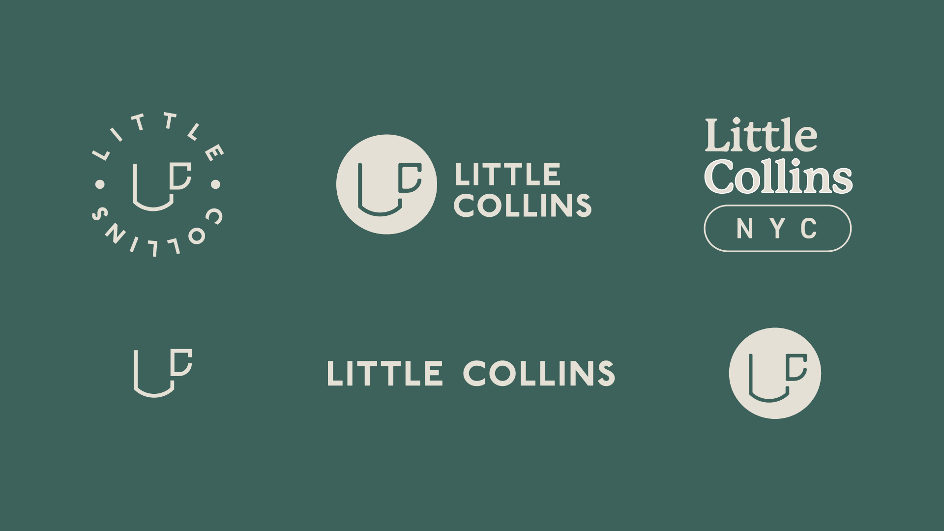
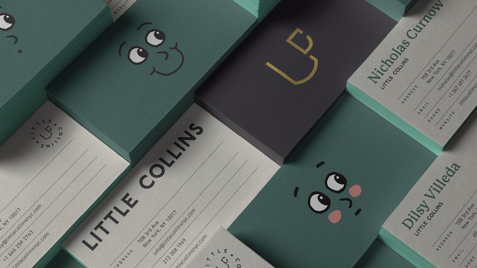
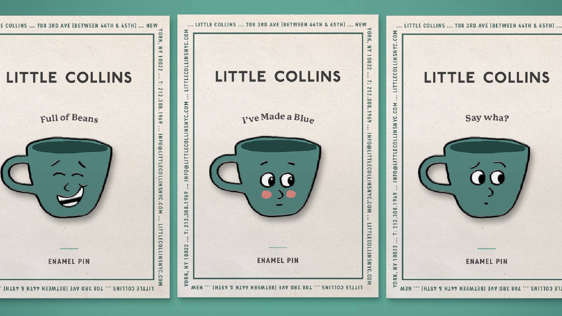
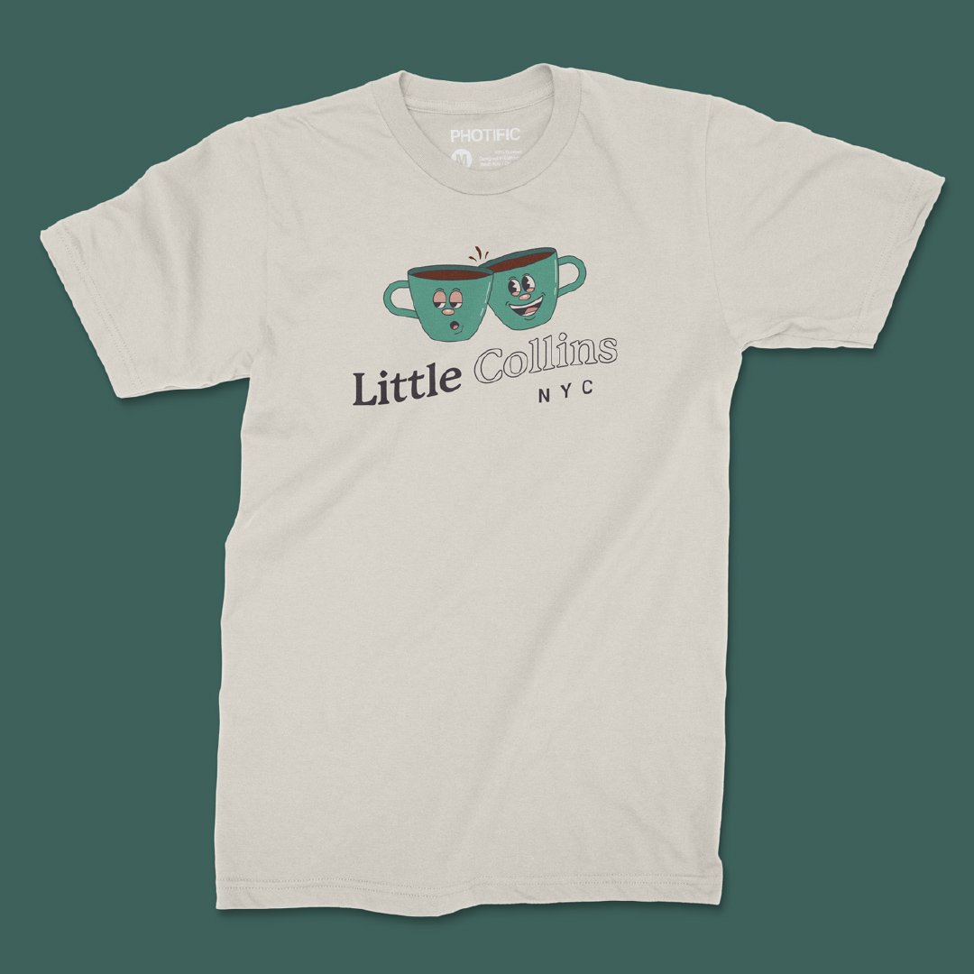
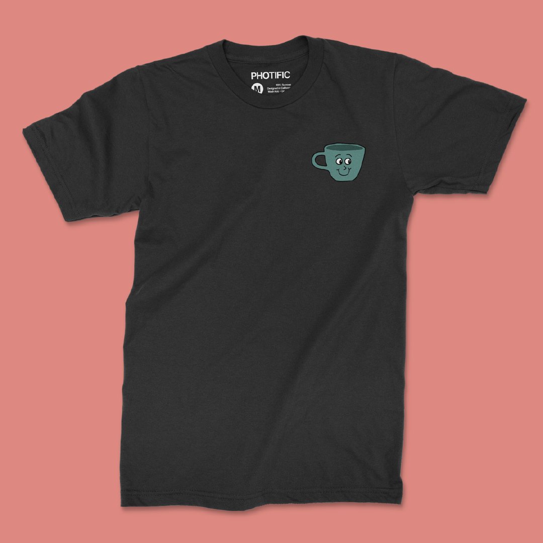
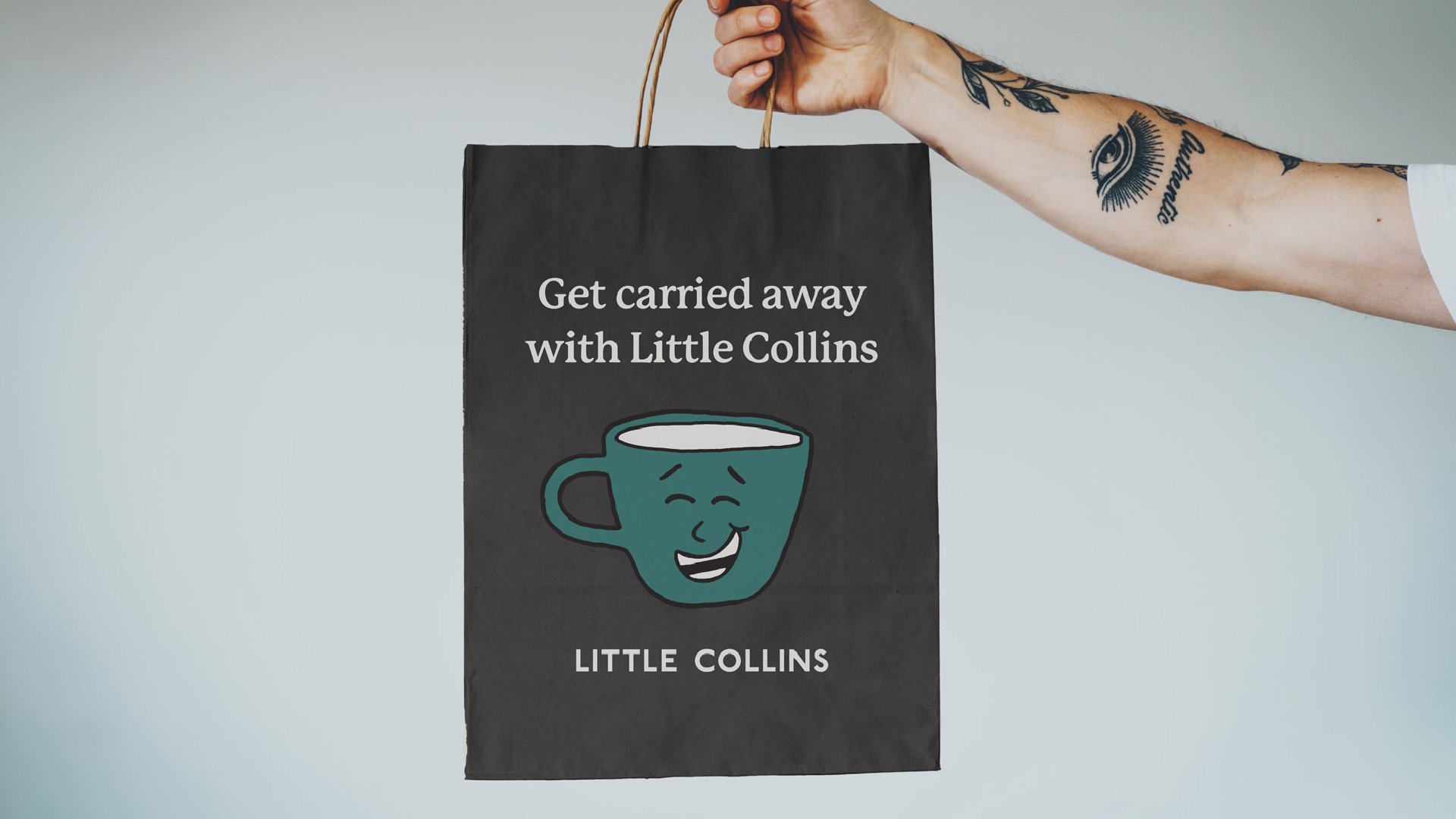
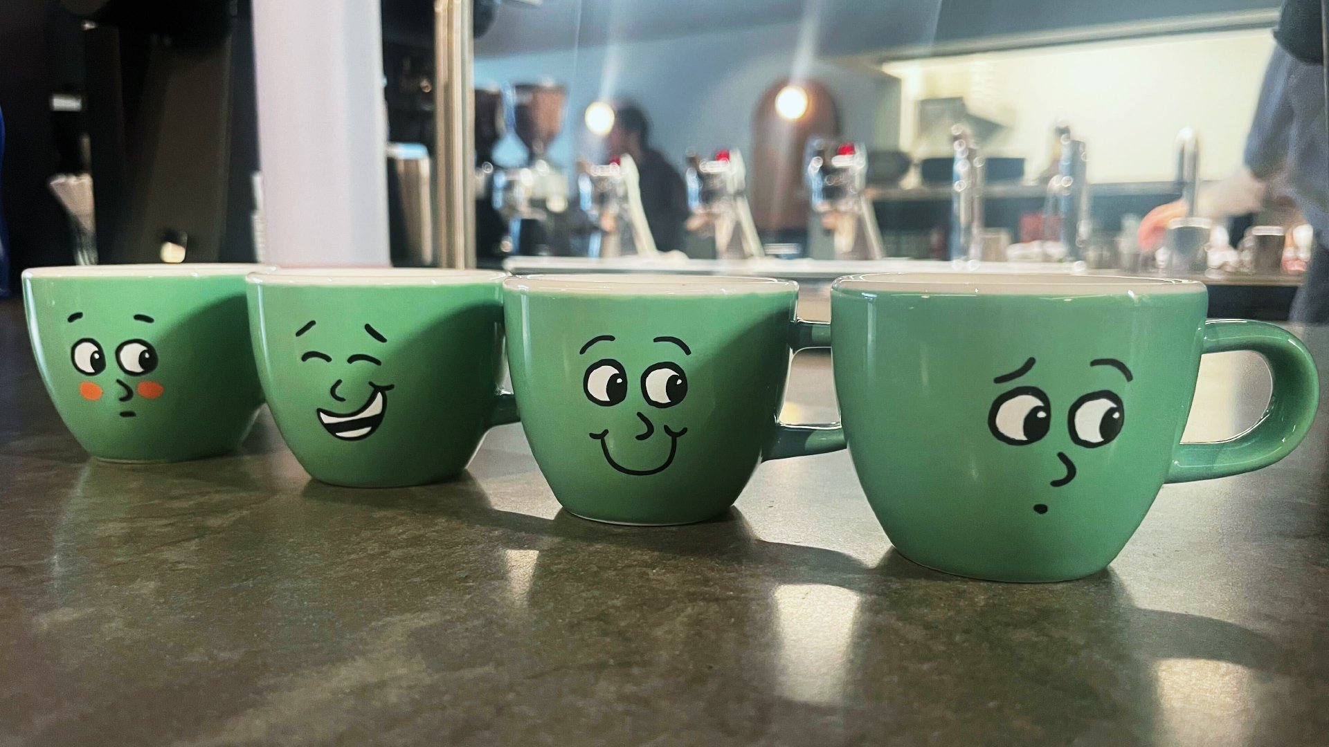
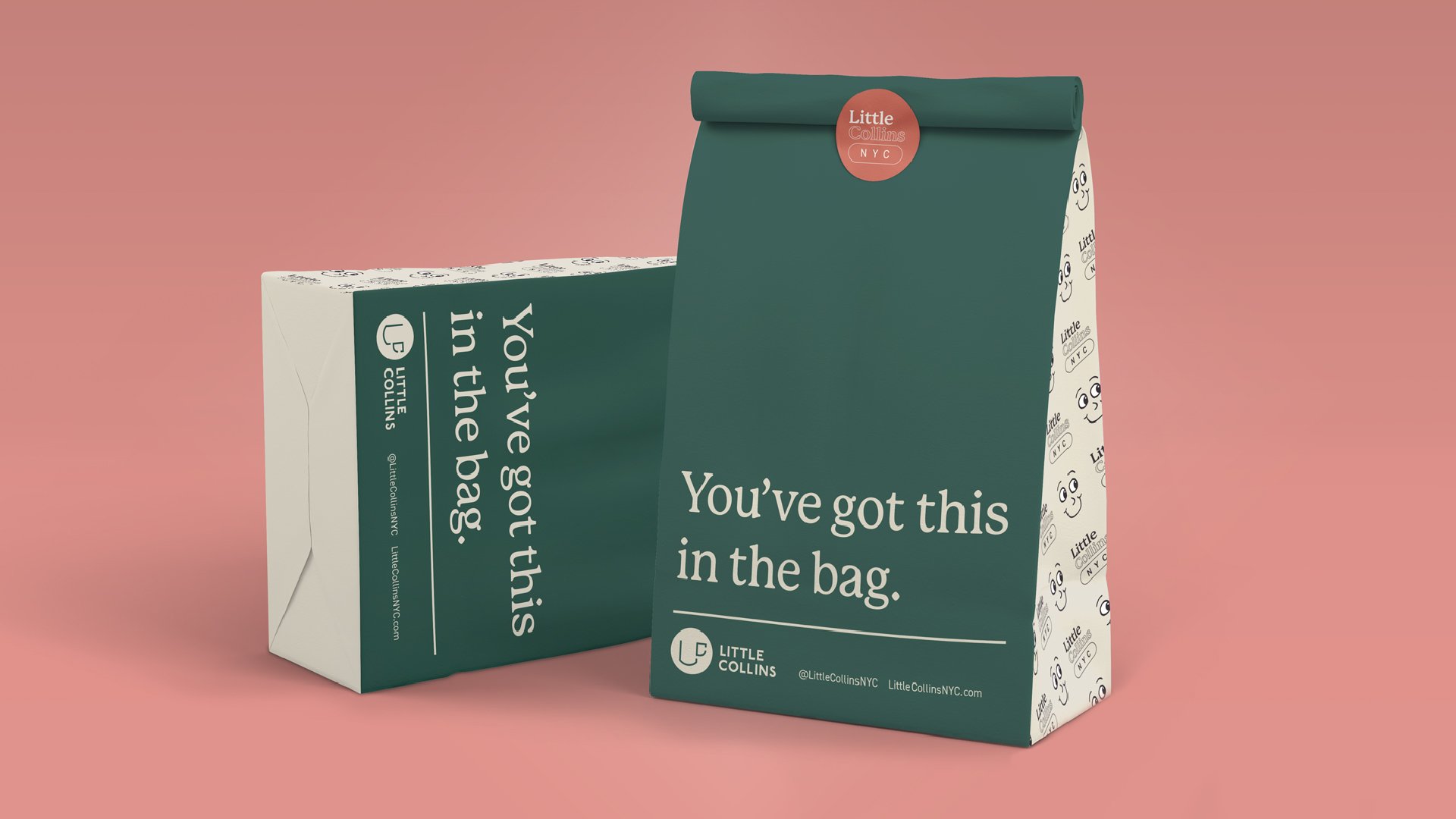
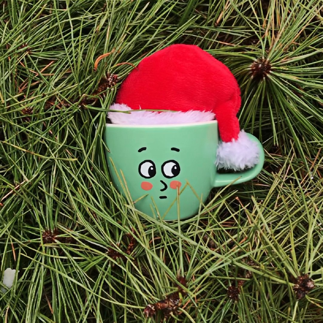
Little Collins

Bringing Aussie charm to NYC

Launch
Four teal mugs featuring different Collin expressions sit side by side. The coffee shop is in the background.

Background

Little Collins café was born out of Little Collins Street in Australia. The café is bringing Australian cuisine and coffee to New York City in a new, elegant fashion. Little Collins took the pandemic as an opportunity to expand their brand toolkit and messaging. When in-person dining resumed, they wanted to be equipped with an invigorated, memorable brand that would charm every patron that walked in the door. They called upon Headword for some help.

Services Provided

  • Brand Identity
  • Digital Design
  • Packaging
  • Research & Strategy
  • Retail
A dark teal and cream colored bag sits against a coral-colored backdrop. The text reads, “You’ve got this in the bag.” Illustrations of the logo and Collin line the sides of the bag. The top of the bag is sealed with a Little Collins NYC sticker.
A teal coffee mug with the face of “embarrassed Collin” fits snug among branches and pine needles while wearing a Santa hat.

Approach

We worked closely with the client while doing a brand immersion. We needed the brand character, voice, and position to guide our designs. We wanted every touchpoint to be elevated and smirk-inducing, just like Little Collins itself. We wanted everyone that had never visited the restaurant to ask “where did you get that?”

There are six variations of the Little Collins logo. All are in a parchment color against the avocado colored background.
The Little Collins color palette is primarily parchment and avocado colors with pops of mint, salmon, and dark gray.
The primary font is P22 Mackinac Pro. It features a serif. The second font is sans-serif. It is called URW DIN.
There are fourteen faces for Collin. In order from left to right and top to bottom, they are happy, sleepy, laughing, ecstatic, grumpy, content, bemused, smirking, concerned, cool, peaking, embarrassed, sad, and cold.

Creative

We gave Little Collins a whole new identity package, including a versatile set of logos to use for all of the restaurant’s needs. In addition, we redesigned their business cards and menus to offer several different options.

Business cards feature the many faces of Collin – one smiling and one embarrassed – as well as the Little Collins watermark. The back of the card has the contact information of those who work at Little Collins.
Three enamel pins feature the different emotions of Collin. Each pin has a cardboard panel with the words “Little Collins” followed by phrases that vary depending on Collin’s facial expression.

Little Collin was the cafe’s mascot and he got a makeover as well. After his fresh new look, Collin found his way into many of our designs. He’s a bit of a cheeky one, so we let him guide our copy direction. Punny little sayings grace to-go bags and his expressive “mug” is featured across much of the Little Collins merch we designed.

A parchment-colored shirt sits on an avocado-colored background. The shirt shows two Collins clinking. One is bemused the other is happy. The text below it reads, “Little Collins NYC.”
A dark gray t-shirt sits on a salmon-colored background. The t-shirt features a Happy Collin on the left chest.
Someone is scrolling on their phone with the Little Collins website pulled up. The main text reads, “Your favorite little spot,” and features an image of their food.
A tattooed arm holds a Little Collins bag. The text says, “Get carried away with Little Collins,” and features a mug illustration with a laughing face.
DEFINE YOUR BRAND.

Ready to take that next step?
We’d love to hear from you.