Approach
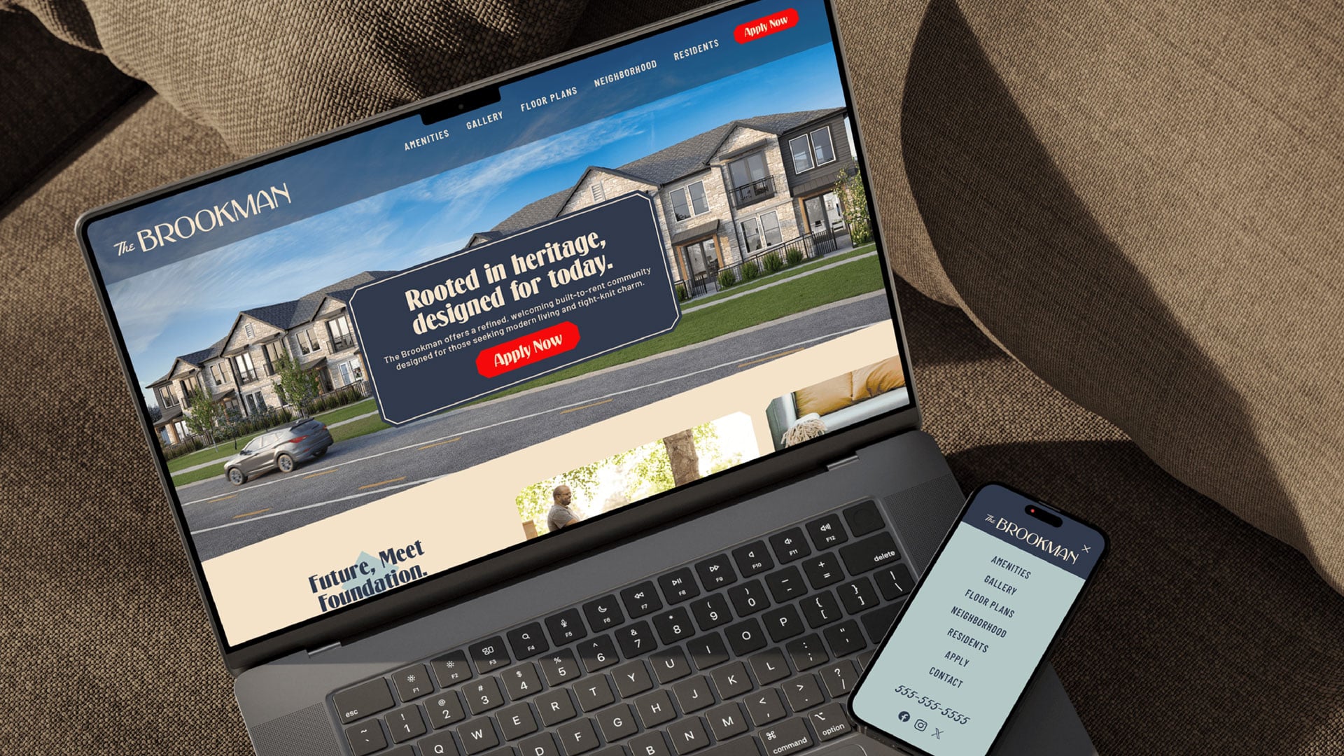
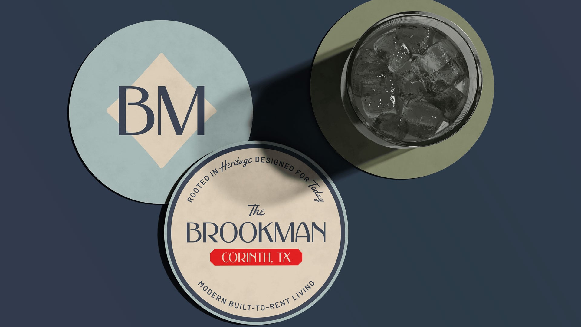
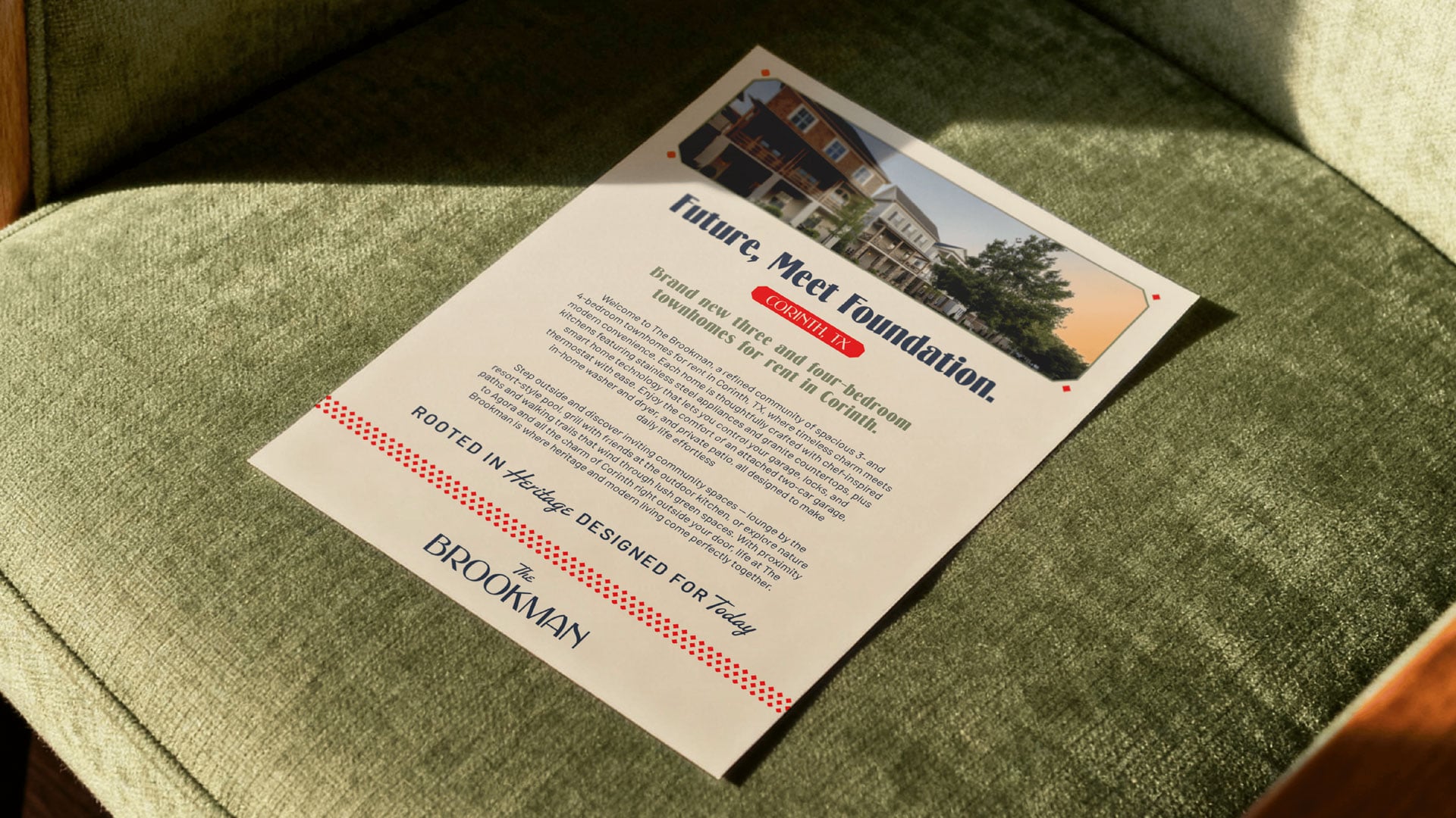
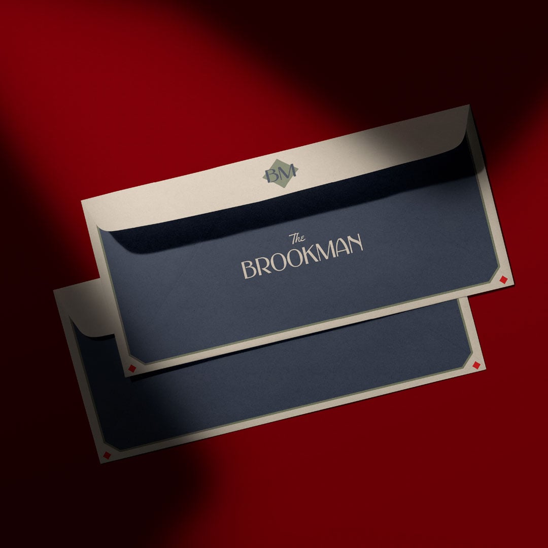
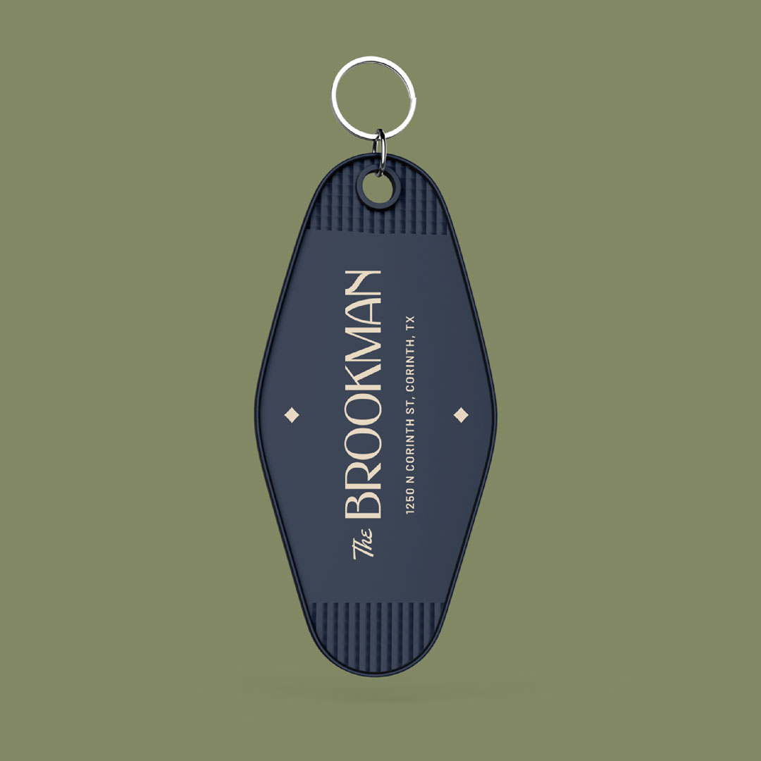
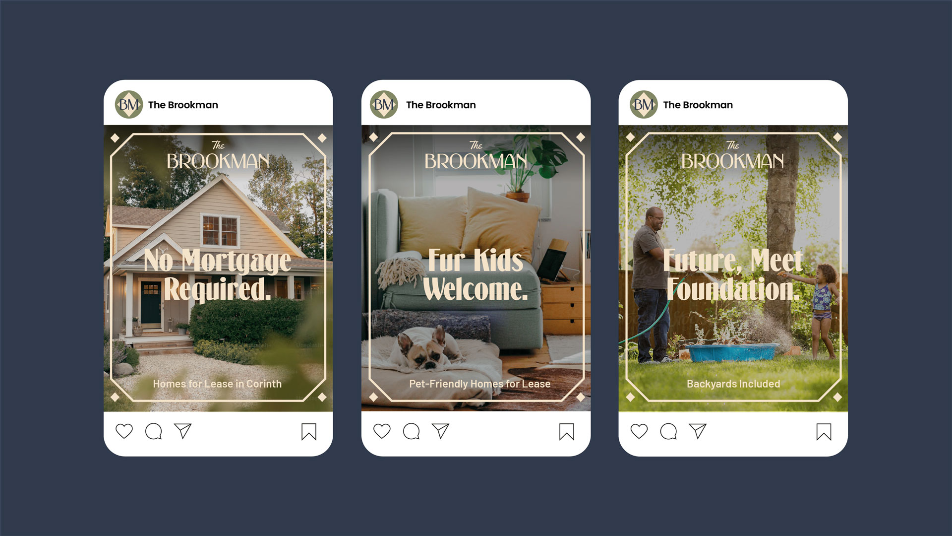
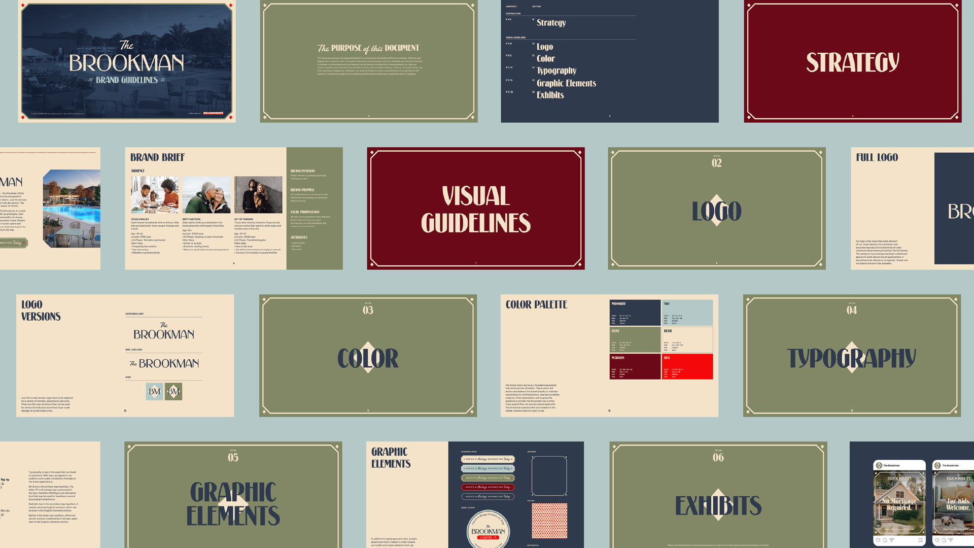
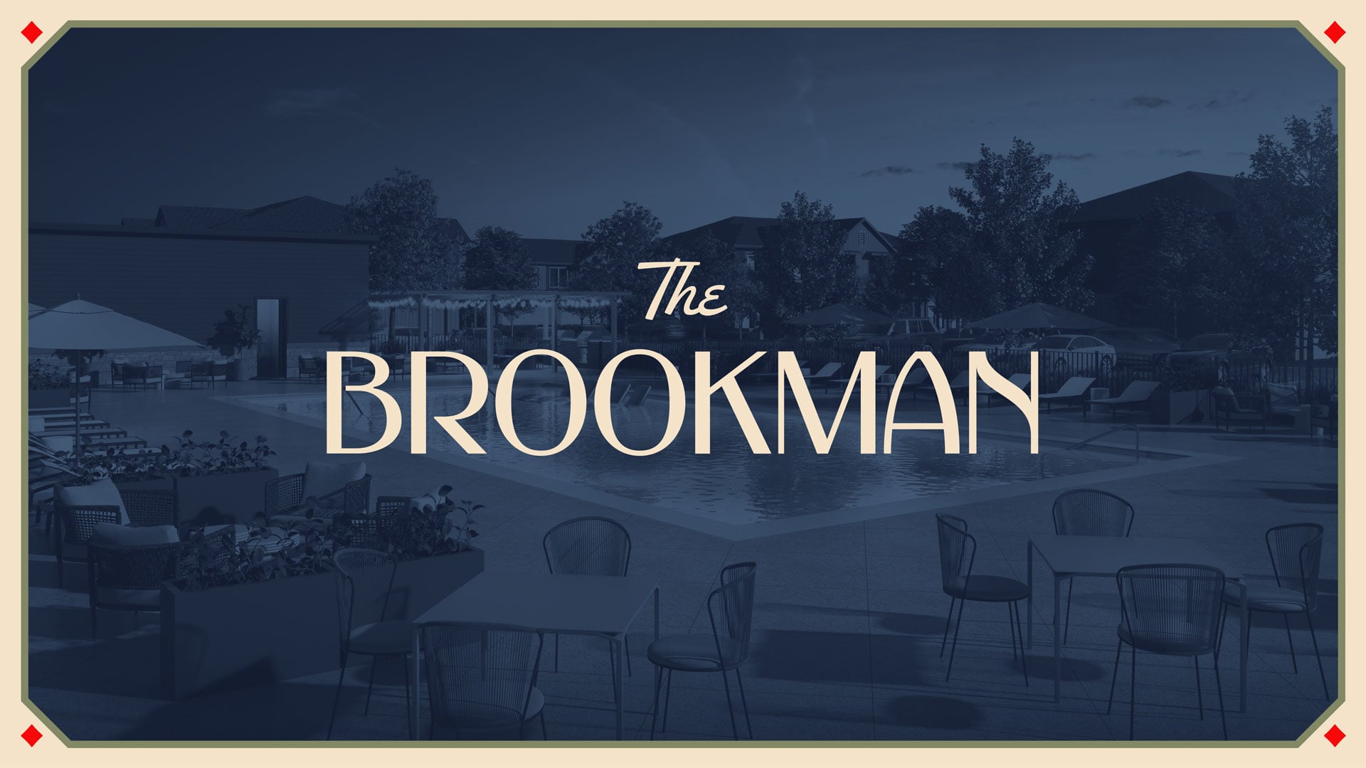
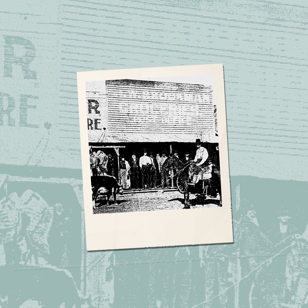
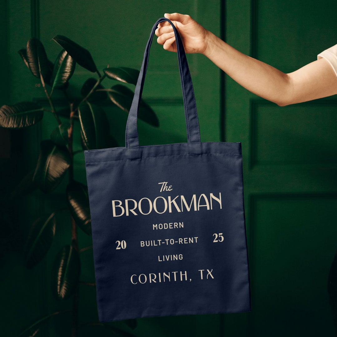
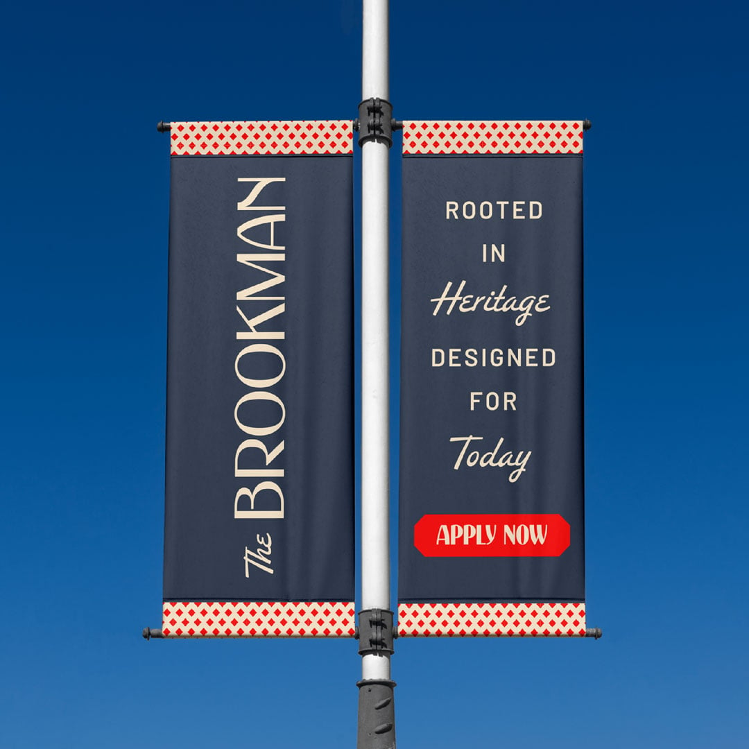
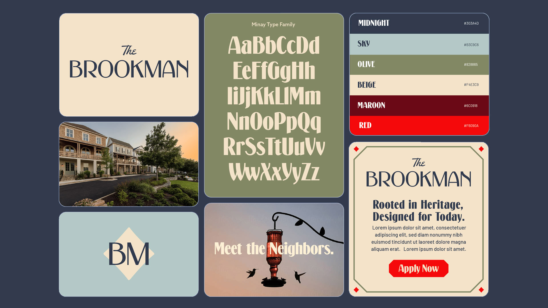
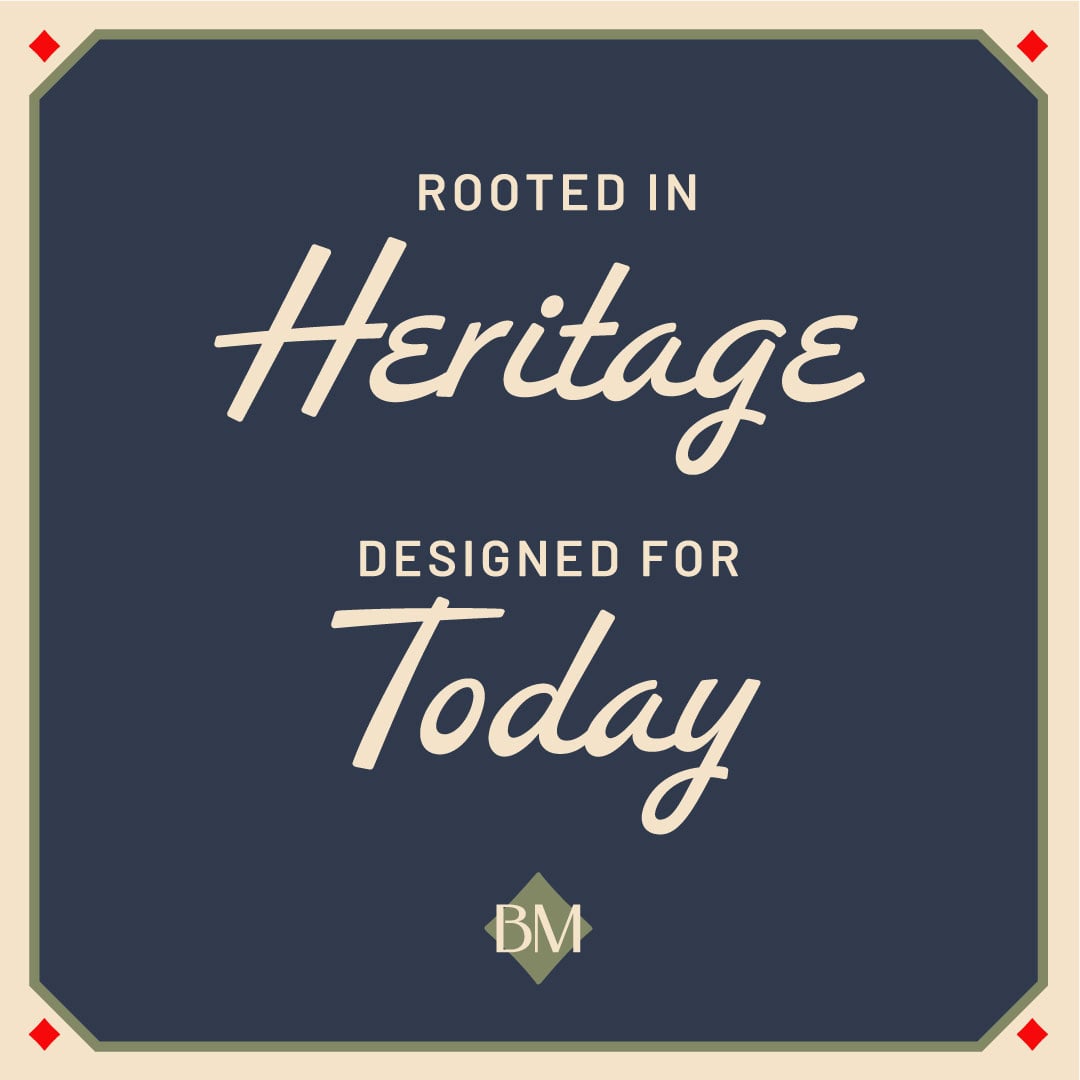
We leaned into Corinth’s heritage to shape a brand that feels classic, warm, and rooted—yet still modern and poised for growth. Inspired by the name’s origins in an old general store, the identity features vintage-inspired typography with refined touches, a soft color palette drawn from the Cross Timbers landscape, and a brand character—a labradoodle—that adds charm and relatability. The result is an identity that feels inviting, sophisticated, and unmistakably Corinth.
The Creative
Our design language needed to balance modernity with heritage to meet this pivotal moment for Corinth, a city largely unchanged for decades, now looking toward the future with new developments, retail, parks, plazas, and housing. We set out to make build-to-rent housing feel both elegant and approachable, high-end yet accessible, and modern while still rooted in its heritage.